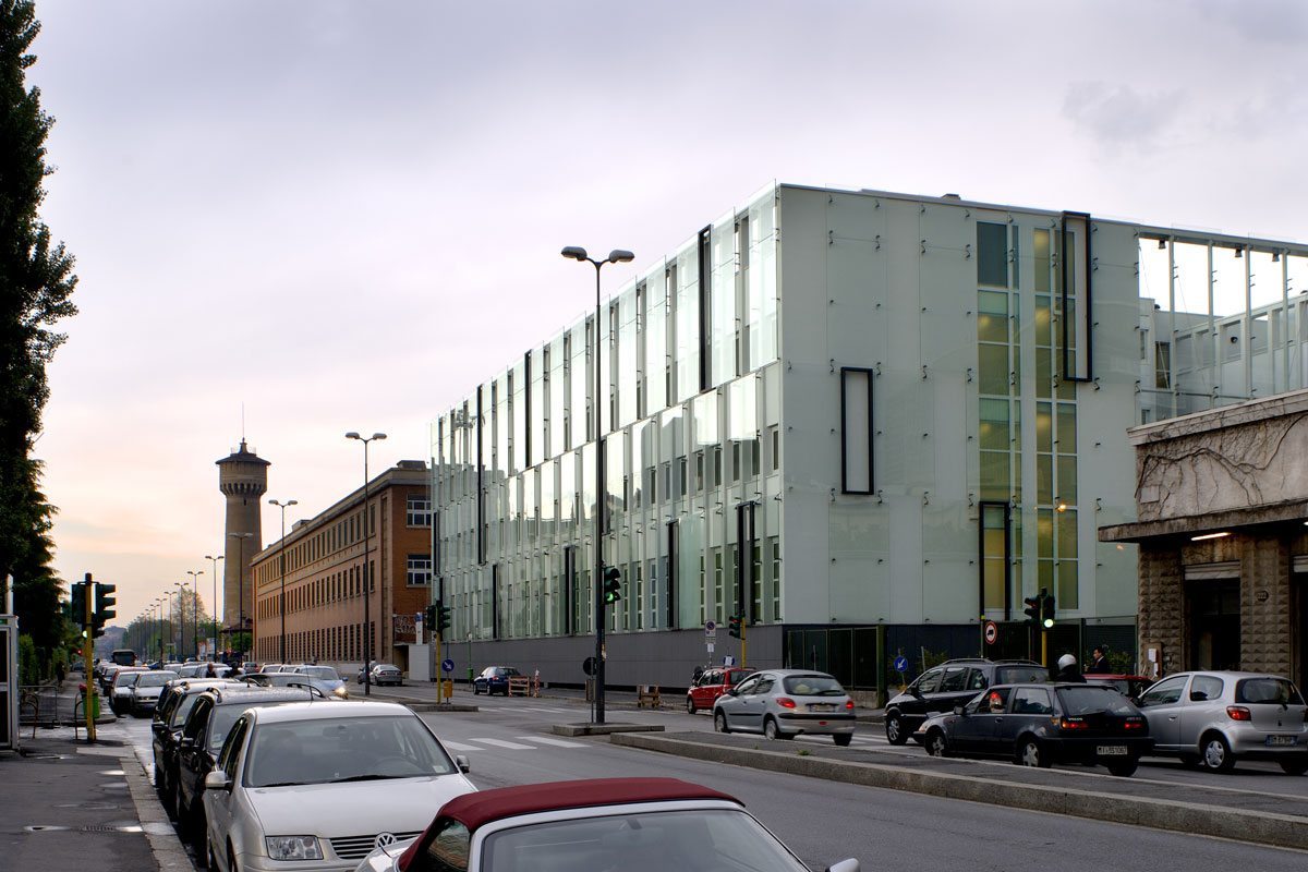
The Cinisello Mall was a project developed by the Boeri Studio that involved the renovation and refurbishment of an existing building that housed the first shopping centre opened in Italy in 1974. The complex was located in an area linked to the centre of Milan and surrounded by a parking space. The project was divided into two phases. The first phase involved the reconfiguration of the space and distribution of the shopping centre as well as the reconstruction of the façades, created using backlit alveolar polycarbonate panels. The second one, which was completed in two years, saw the addition of a large space for a multi-storey covered car park. The volumes involved are therefore two: the base area of the shopping centre and the parallelepiped of the parking lot. If the former had a layout that spread over the ground developing little in terms of height, the latter had a more limited ground area but emerged more into the city skyline.
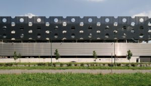
The parking area framework is made of reinforced concrete pillars which are hidden behind stainless steel panels that cover all four sides in an unbroken band. From observing the four fronts one has the impression of being in the presence of three floating volumes placed along a single vertical axis; this is due to a tri-partition of the facades obtained by an alternation of full and empty spaces and by the staggering of different surfaces that generate a shadow edge that visually cuts the façade. This effect is also accentuated by the use of different materials, standardized by numerous holes that allow an interaction between inside and outside by piercing the surface. Starting from the ground, the three bands gradually acquire a greater height, increasing the size of the holes and taking on darker hues. The first band, pure and massive, represents the basement of the building and the rectangular openings allow cars and people to access the building.
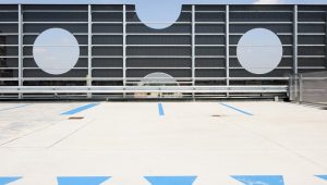
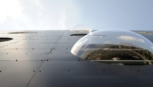
The second band is covered with a metallic, corrugated and micro-perforated skin. The emptied corners reveal the nature of the pure metal sheet cladding. The most impressive band, the last, has flat plates whose mounting elements are left exposed. The surface is pierced again but the attention is drawn to the large carved circles. The scale of the holes is increased, so as to show at times a void, a slab or a balustrade. It is only at this higher level that some of the holes are filled in with transparent semi-spherical bubbles. In this case, the skin functions as a parapet for the top floor: in fact, a room with the sky for the ceiling.
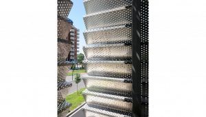
The clear and orthogonal shapes of the volume compare with the rounded shapes of the holes, an outline that repeated in the ramp connecting the floors which with its circular layout wraps the entire volume with a micro-perforated metal mesh.
Make holes to give lightness. The holes that cover the surface have been designed to generate transparent spaces that connect the external environment of the city with the interior as well as to bring light and air into the parking space. In addition, together with the use of materials with limited thickness, they contribute to lightening the image of the car park which would otherwise result in a heavy volume looming over the commercial space.
The decision was taken to play with very few colours, preferring limited gradations: the parking cover materials vary from light grey to darker grey, and the base is white. The other colour is yellow, used only for isolated elements or on small scale surfaces such as the concrete walls in the various parking levels and the metallic roof of the shopping centre which stands out from the bulk of the parking space precisely through its colour.
Colours. The decision was taken to play with very few colours, preferring limited gradations: the parking cover materials vary from light grey to darker grey, and the base is white. The other colour is yellow, used only for isolated elements or on small scale surfaces such as the concrete walls in the various parking levels and the metallic roof of the shopping centre which stands out from the bulk of the parking space precisely through its colour.
