Images
Project
Boeri Studio
Location
Milan, Italy
Year
2007 - 2011
Client
HINES Italia Srl
Typology
Architecture, Interior Design
Surface
GFA: 800 sqm
Design team:
Stefano Boeri (Founding partner), Gianandrea Barreca (partner), Marco Brega (project manager), Chiara Quinzii (project leader), Inge Lengwenus (project leader), Alessandro Agosti, Daniele Barillari, Frederic De Smet, Kristina Drapic, Marco Giorgio
Images:
Paolo Rosselli, Iwan Baan
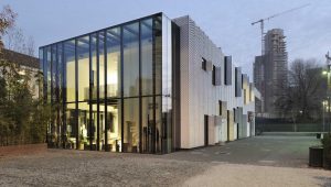
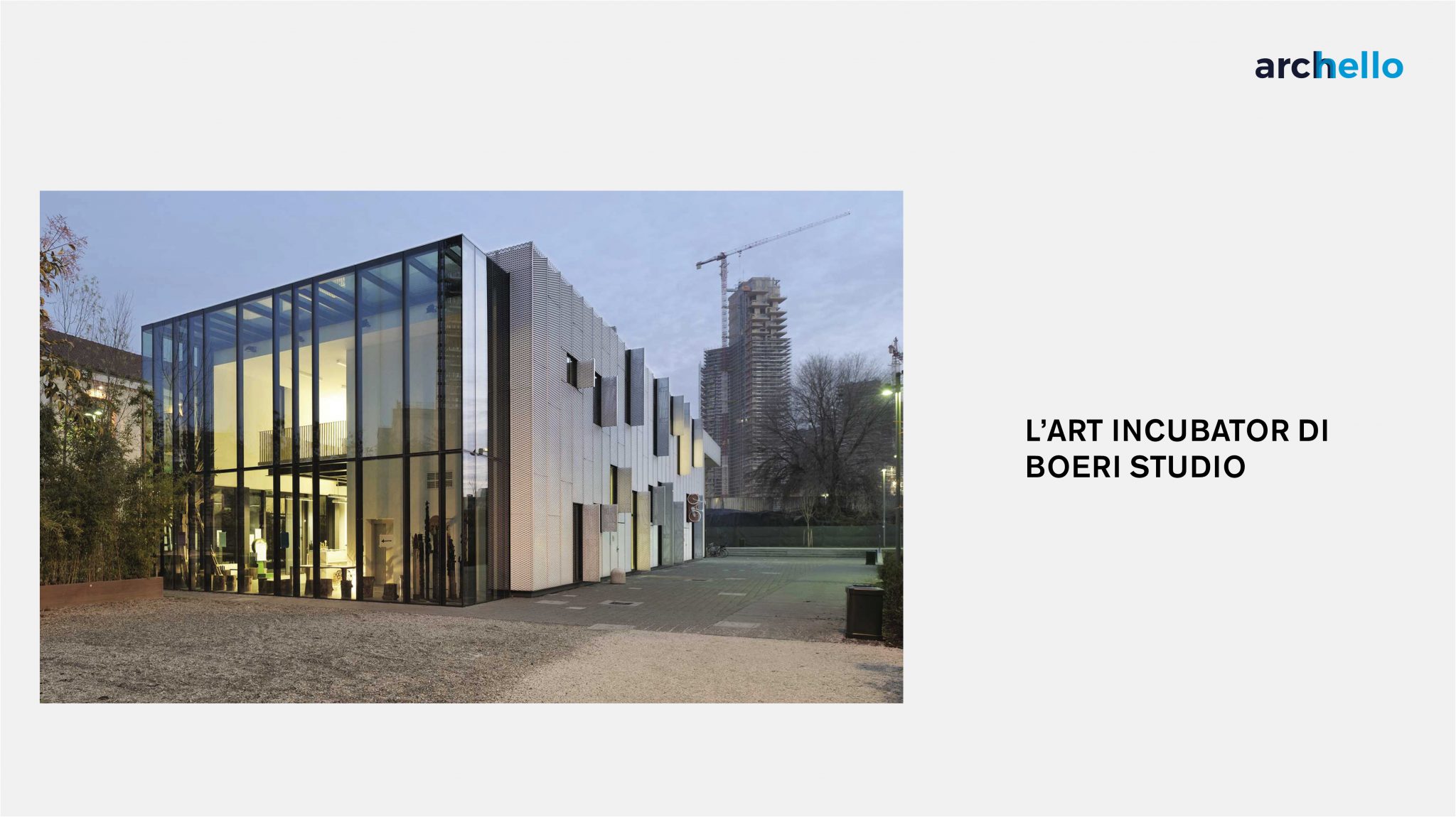
The Incubator for Art, also known as Stecca 3, is located in the heart of Milan’s Porta Nuova, a district that since 2005 has been the subject of an extensive urban redevelopment project. Relatively small in size compared to the monumental verticality of the skyscrapers that surround it, the new building faces south on the Parco della Biblioteca degli Alberi while it is flanked to the northeast by the Riccardo Catella Foundation building with its garden. In this context of significant pre-existing buildings and green spaces, the incubator plays the link role between a part of the city and the large park under construction.
Its location in an area undergoing great change and subject to rapid transformation has meant that the complex took on social, economic and relational importance that allowed it to acquire a role as a fundamental centre for association and meeting. In actual fact the Incubator for Art stands on the site of the old Brown Boveri industrial building, part of the so-called “Stecca degli artigiani” and demolished during the redevelopment of the area, and as such has inherited its important legacy: from the 1980s the structure had become a reference point for numerous self-managed craft workshops and shared urban planning activities as well as an all-embracing social centre where a large number of associations were based.
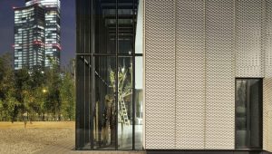
In Boeri‘s new project, the latter have now cemented their place and others have been added. Furthermore, in order to keep the social character of the place alive, every five years the Milan City Council promotes a call for tenders so that cultural, voluntary and participatory activities can alternate with a target audience ranging from youth meeting groups to environmental sustainability, from multicultural integration to activities for children, from self-production to archival activities. The basic idea was to maintain an industrial character for the new artistic incubator: cheap construction materials and techniques were employed, such as the perforated frame made of dry-mounted aluminium sheets and it was decided to resume the volume and colours typical of the industrial and artisanal structures of the Milan of the late twentieth century.
The space consists of a single parallelepiped of about 800 square metres divided into two floors. On the ground floor there are 3 large laboratories of different sizes, as well as two smaller multi-functional spaces, while on the upper floor there is an open space where conferences, meetings and exhibitions can be held.
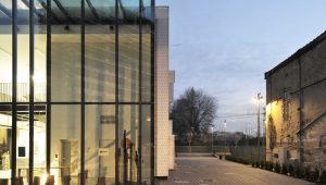
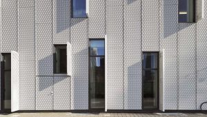
On the outside the metal cladding is punctuated vertically by the joints of the panels and by the long openings provided by a brise-soleil of the same dimensions which is perpendicular to the wall and which creates unprecedented interplays of light. The building opens up to the surrounding city, contradicting its compact and introverted form through various formal devices including the obvious and massive protrusions of the cantilevered roofs on the south and east sides and the large full-height window to the north which offers a showcase featuring this city of activities organized by the cultural centre. A staircase below the canopy facing the park leads to a semi-open space used as the first floor atrium. The alternation of full and empty triggers an interesting material dualism which is resolved in the attempt to lighten a seemingly massive body that is not pervious to view.
The metal sheet also embraces the roof, which houses a series of photovoltaic panels. Moreover in an attempt to reduce energy consumption, the structure is equipped with a heat pump for heating the rooms.
The interior spaces are designed with a tendency towards neutrality in terms of colours, and flexibility regarding the division of walls and furniture: white dominates and is found in all the rooms and spaces making them bright and constantly suitable for the activities carried out within.
