Images
Project
Stefano Boeri Architetti China
Location
Shanghai, China
Year
2020
Client
Art Pioneer Studio Limited
Project:
Stefano Boeri Architetti China
Partners:
Stefano Boeri, Yibo Xu
Architecture design Director:
Pietro Chiodi
Project architect:
Cecilia Picello
Architect:
Zhiyang Huang
Account management:
Palace Gong
Lighting Company:
Guangzhou Hongri Lighting
Construction Company:
Jiang Architects & Engineers (JAE)
Photo and video:
Art Pioneer Studio
Stefano Boeri Architetti, with his Chinese branch, has designed a very peculiar space for Art Pioneer Studio, located in the very heart of Shanghai Lujiazui Central Business District, inside L+Mall.
The project, called “APS Museum” aims to provide a unique exhibition space and display platform for Chinese and International artists. L+Mall is a space that brings together diverse uses: restaurants, leisure and entertainment spaces, retails shops and China flagship store of Galeries Lafayette.
Positioned at the third floor of the mall complex, with an escalator giving direct access from the ground floor, a 360-Square-meter space has been dedicated to this project.
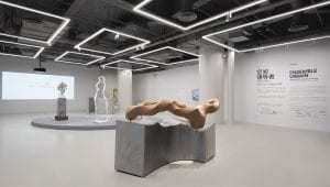
As for client requests, the Artwork exhibition area is a cutting-edge space, also spacious in size. The lightning and interior design reduces the sense of oppression caused by a previous suspended low ceiling.
Stefano Boeri Architetti China have also designed interior side spaces such as the entrance desk, a small shop for art exhibition related items, storage space, and a VIP room for Art Pioneer studio’s directors where to exhibit special pieces, while entertaining their guests.
The APS Museum Concept started with the idea of detaching itself from the commercial feeling of the rest of the mall, declaring its presence with a strong visual impact, and at the same time, engaging visitors with curiosity and ultimately rising interest in the art field to a wider public.
The entrance block is 83 sqm and has therefore been conceived as a solid blue volume, supporting almost all the side functions required by the client (corridor, shop, VIP room); meanwhile, the bigger block – 228 sqm – is dedicated to the main exhibition space.
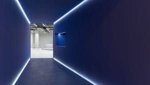
The façade is so appearing as a solid, plain, strong, blue volume. From this solid volume, two pieces have been subtracted: one to create a long/ stenographic tunnel entrance (6,5 m long) which is revealed as visitors approach the entrance, and one to create a frame for the little art shop on the right side of the façade (which is also the closest point to the general flow of the shopping mall’s visitors).
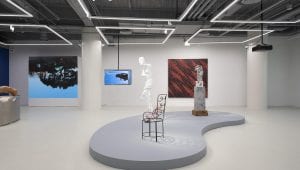
The tunnel, crossing the entire entrance volume, is giving direct access to the main exhibition space. In this area, Stefano Boeri Architetti China have removed the existing ceiling and decided to keep visible the MEP structure in order to take full advantage of the maximum high (5,5 m high). The space has been left free of any constriction so to provide APS Museum with the maximum flexibility for the set-up of different exhibitions, hosting four exhibitions per year.
The Light design is the strongest element of the exhibition area, where a series of linear squared-shape lighting sources are giving rhythm to space. Peculiarity of the lighting system is that each “square” is provided with a double rail for lighting support. The first one is providing a diffuse light for the whole space; the second rail is meant for spotlights that can be adjusted according to different needs.
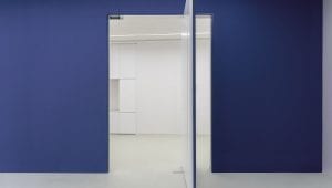
Looking at the front block from the Exhibition Area, guests will perceive again the solid blue volume. In the center the tunnel entrance, at the side 2 big blue rotating doors will lead to the VIP room and to the “APSTORE”.
APSTORE is a little space of 30 sqm designed also to have the maximum flexibility. The walls are provided with a modular shelf system that can be easily changed according to the needs.
Additional squared blocks can be added in the center of the store space, if extra space is needed for different pieces.
The ceiling and the floor as well are painted in strong blue to emphasize the volume perception. The thick wall of the window shop also enforces the volume perception framing the window display and allowing for space to be set up in different ways. This wall is also hiding extra storage space for the shop. The casher of APS shop is facing also to the tunnel entrance, becoming also the welcoming desk, using the spaces to the fullest.
